Performance reporting or Performance Monitoring is something of a must in any storage environment today, I remember many times when I was in VMware Support when facing a customer storage performance issue that metrics were not there to capture the event, and most storage performance tools required enabling, obviously this meant that the issue had to be occurring at the time of the performance metrics grab, vSAN in the early days was no different, vSAN Observer whilst being a detailed tool and provided a lot of information, was not a historical tool, it was enabled to troubleshoot a performance issue that was happening at that particular time.
In the later releases of vSAN the UI came equipped with more performance metrics than you could shake a stick at, which from a performance troubleshooting and monitoring perspective is the dogs danglies, but what does this mean from an every day perspective? Before we take a look at the UI, there are three areas where vSAN Performance metrics can be displayed
- Cluster level – This is the performance metrics aggregated for the whole cluster and allow you to have the high level view of how your cluster is performing as a whole
- Host Level – This allows you to look at how vSAN is performing on a host by host perspective and contains further information drilling down through things like Disk Groups, Physical Disks, Network Controllers, VMkernel interfaces.
- VM Level – This focuses on a specific virtual machine and the objects associated with it.
So what information do we have exactly for a given observation level? Well let’s first of all take a look at the cluster level performance information, there are three options under the performance tab for vSAN
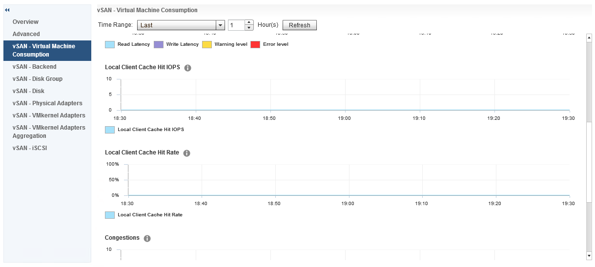
- vSAN – Virtual Machine Consumption
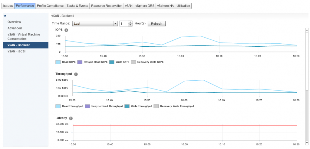
- vSAN – Backend
- vSAN – iSCSI
 I have met many customers that immediately notice there is a big difference between the Virtual Machine Consumption and the Backend graphs, so before we go any further let’s talk about what each of these specific areas mean.
Virtual Machine Consumption
These graphs represent the values that objects residing on the vSAN Datastore are seeing, now remember everything that exists on vSAN is an object, so consumers that are counted in these graphs are Virtual Machines, Stats Objects etc
Backend
These graphs represent the backend disks associated with vSAN, cache and capacity
Both sets of graphs cover the statistics for:
- IOPS
- Throughput
- Latency
- Congestion
- Outstanding I/O
iSCSI
The iSCSI Performance graphs contain all the graphs above with the exception of Congestion, these graphs are in relation to each iSCSI Target/LUN created and each one is selected in turn to review the performance graphs associated.
If we move our focus to a host level, in here we have a number of options in addition to the three we also see at a cluster level, however there is some additional metrics we get at a host level for Virtual Machine Consumption and Backend, in the Virtual Machine Consumption graph we have Local Client Cache Hit IOPS and Local Client Cache Hit Rate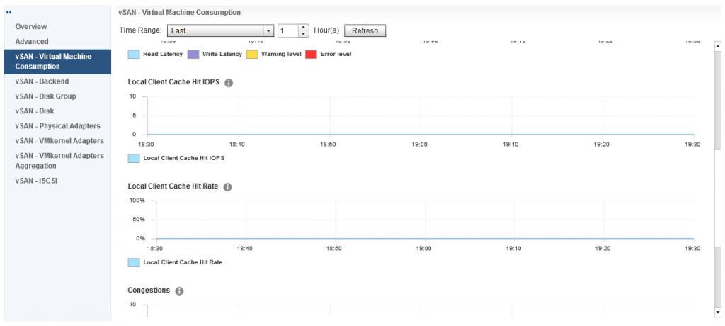
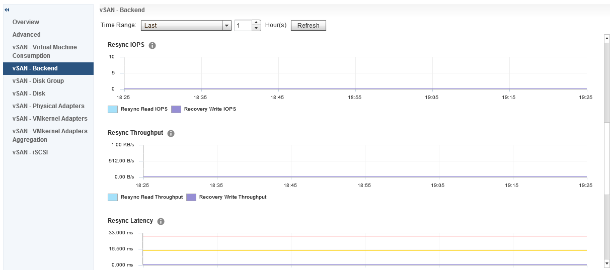
And under Backend we also have some additional graphs for Resync IOPS, Resync Throughput and Resync Latency The resync metrics are extremely important if vSAN is recovering from a failure of some sort and performing a resync of degraded components, it is also important if you are performing a pro-active rebalance, policy change or a full data migration during host or disk/diskgroup evacuation.
The other options listed under host vSAN performance are:
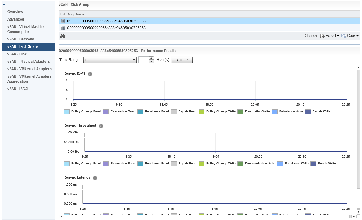
- Disk Group – Shows the performance graphs for the disk groups, I will cover this below as this is one of the most interesting set of metrics with a lot of detail.
- Disk – Shows the physical disks in the host reporting on IOPS, Throughput and Latency
- Physical Adapters – Shows the network stats for each vmnic associated with vSAN, stats include Packet Loss Rate which is good for troubleshooting networking issues
- VMkernel Adapters – Shows the statistics for each VMkernel configured for vSAN, this also includes a Packet Loss Rate which you can then use to troubleshoot the software network stack
- VMkernel Adapters Aggregation – This is an aggregation of all VMkernel interfaces being used for vSAN on the host
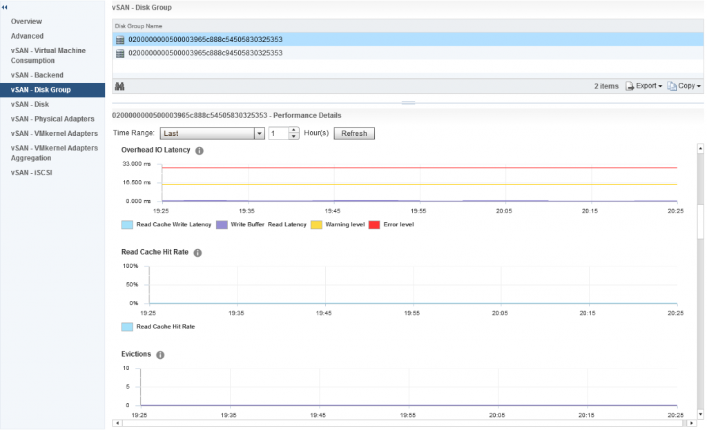
Now let’s go back to the Disk Group performance graphs, as I said earlier this is a very interesting group of metrics to explore, so what do we have in this group? The first section is all about Frontend (Guest) IOPS, Throughput and Latency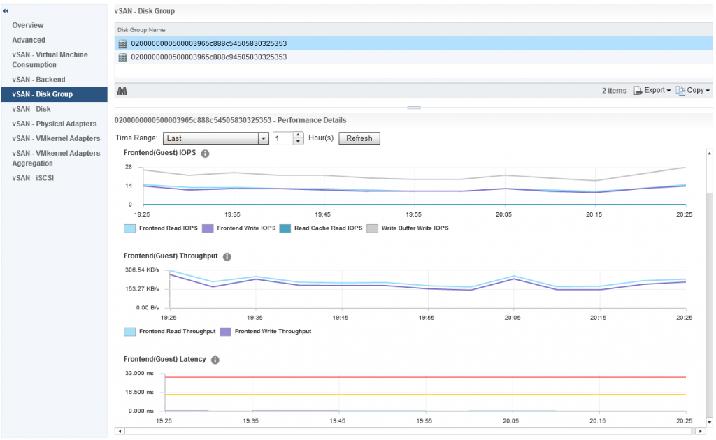
The frontend statistics are maybe as you have guessed already, they are related to vSAN Object I/O being generated from guests running within the vSAN cluster. If we scroll down a little further we can see statistics relating to Overhead IO, Read Cache Hit Rate (for hybrid) and Evictions:
Further down we have statistics relating to the vSAN Write Buffer and De-stage rate clearly showing how much of the write buffer is free and also how quickly data is being de-staged from cache to capacity, now we also have resync metrics under disk groups, however this differs slightly against the Cluster Wide Backend statistics, in the disk group graphs we actually have values that represent various aspects of the Resync Operations, the graph differentiates between:
- Policy Changes
- Repairs
- Rebalance
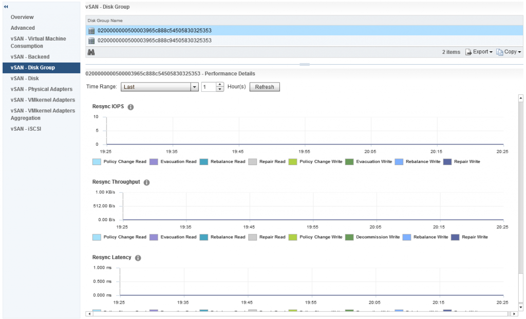 So you can easily distinguish what resync operations are happening by the statistics within the disk group stats.
Collection Interval
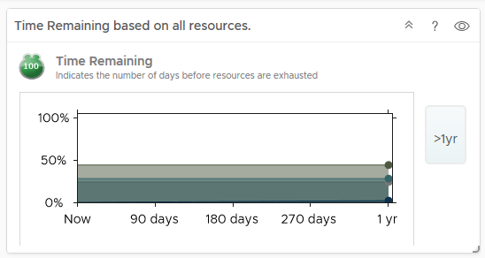
The vSAN Performance metrics collect the sample every five minutes, and this is an average over that five minute period, if your cluster is hardly doing anything (like my cluster for the screenshots) then this can throw out some of the latency numbers, in my own cluster I have noticed it shows higher latency when doing practically nothing than it does when I start putting load on the cluster. I have spoken to many customers about this, it is no concern, it just means that during the collection sample maybe a few “Large” IO operations returned a larger Latency and because of the low number of samples, this skews the average, so no cause for alarm on that one.
Up next will be Day-2 Operations, Performance Monitoring with vROPS, I just have to write it first 🙂
 Now the above three dashboards will no longer be available after the 90 day trial period has expired, and also the link to the vRealize Operations appliance will not be functional either, but after the 90 day trial period has expired, the following three vSAN Dashboards will still be fully functional and available, so let’s look at those in a bit more detail:
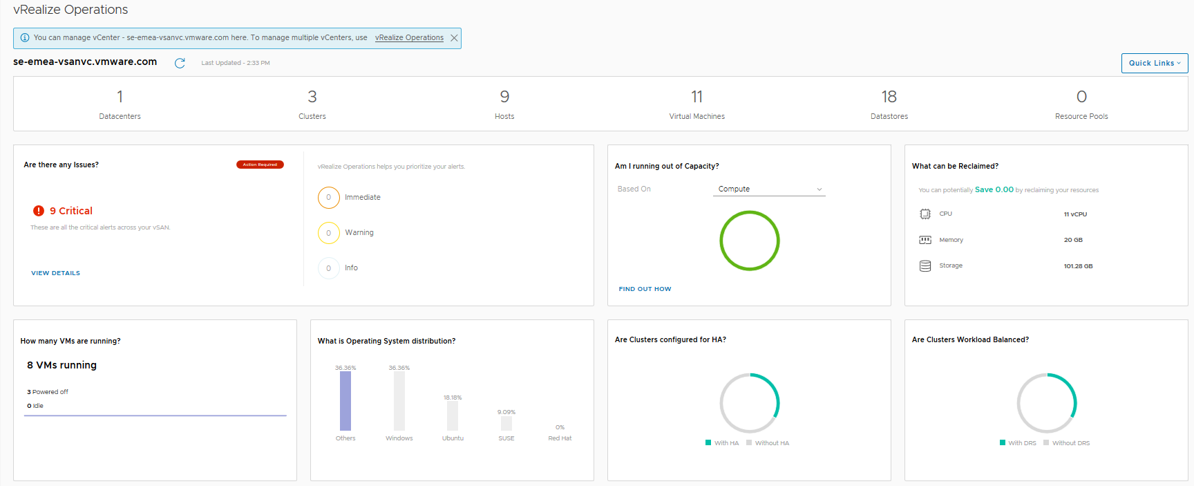
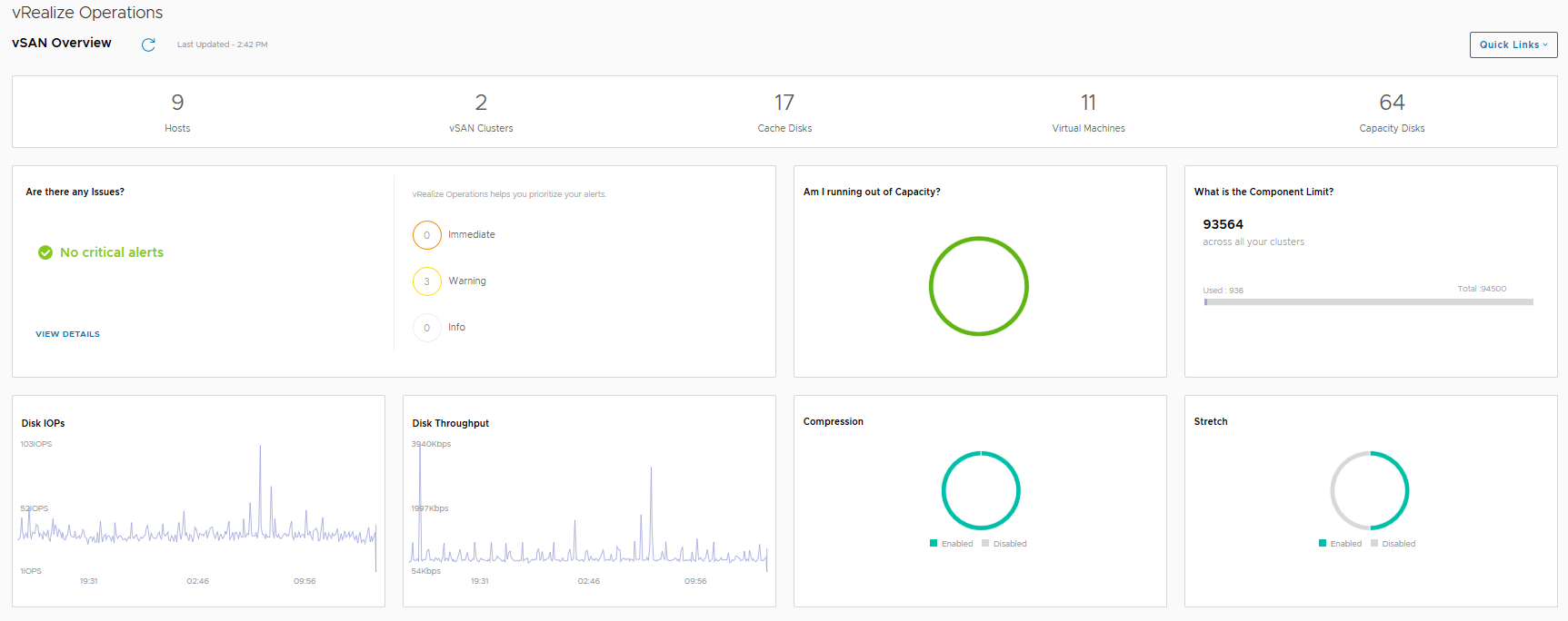 The vSAN Overview dashboard, like the vSphere overview dashboard, displays information at a holistic level for all of your vSAN Clusters within this particular vCenter server, you will see that the dashboard provides information on how many clusters are running dedupe/compression, or how many of the clusters are a Stretched Cluster for example. The dashboard also shows if you need to investigate any current alerts (yes I cleaned up the failed disk before grabbing this screenshot).
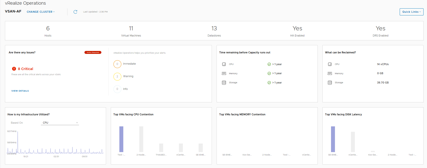
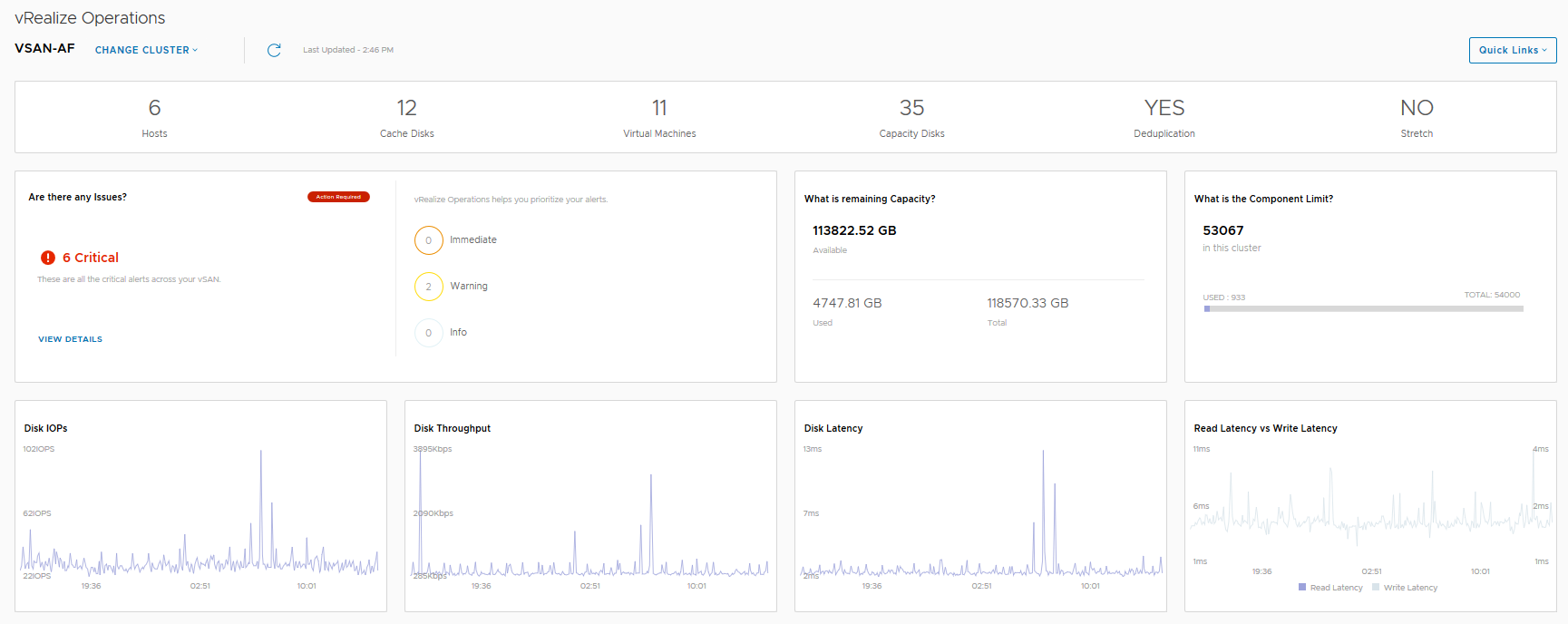 In this dashboard we see information pertaining to a specific cluster, we can see that I have 6 critical alerts which we will take a look at next, but there are some key metrics here that from an operational perspective are pretty important from a day-2 operations standpoint:
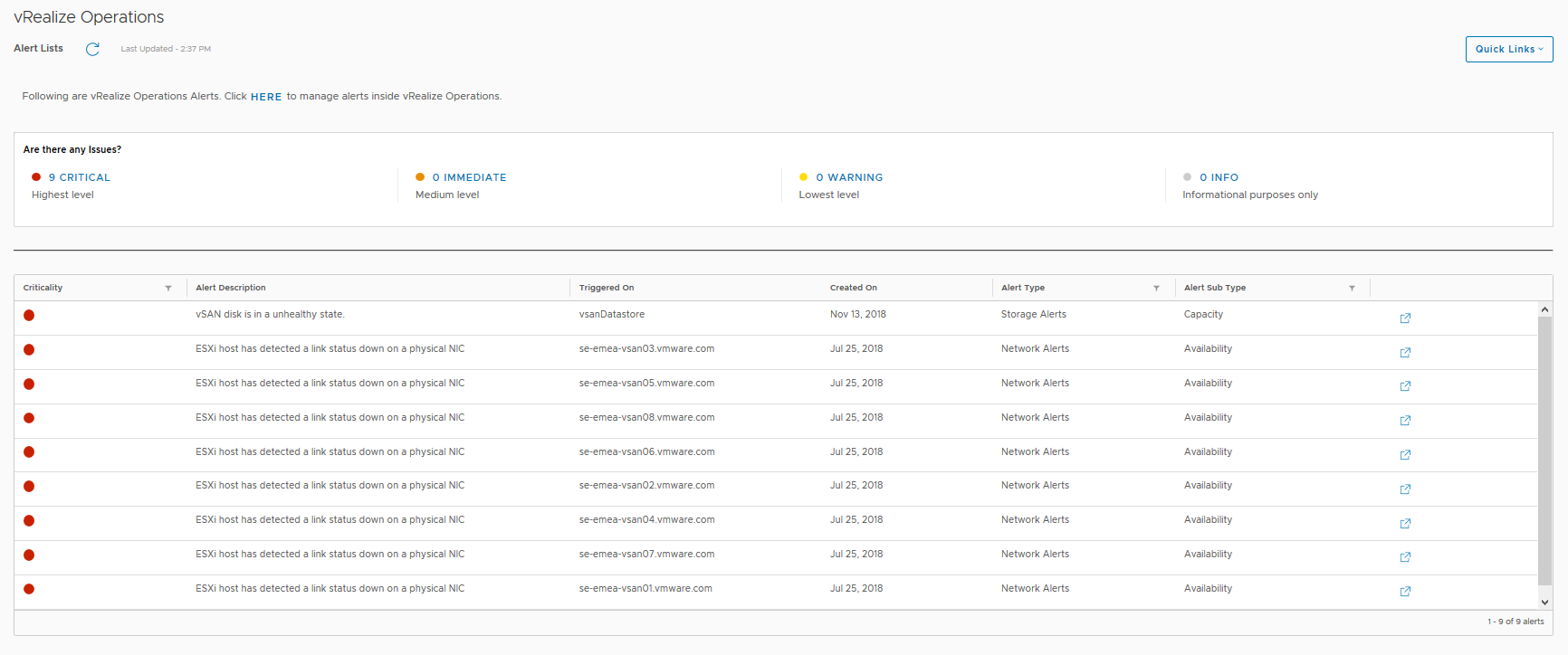
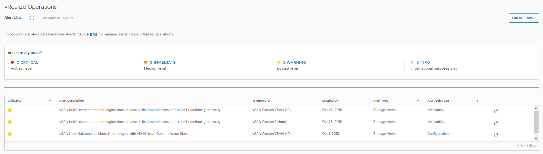 Here we can see the current alerts that have been triggered for each cluster which may need to be addressed, the critical alerts previously highlighted in the cluster view were all related to a network redundancy lost when I was troubleshooting packet loss on the physical switch.
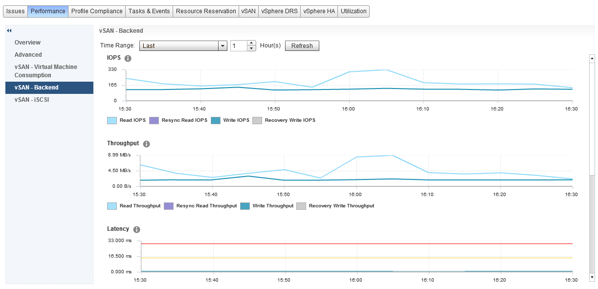


 One thing that you will immediately notice here is that there is no category for Snapshots, now I remember in my support days, Snapshots were any administrators nightmare, especially when you have inadvertently ran your Exchange server on snapshots for almost 12 months without knowing, so in my opinion that is some important detail that is missing here and that feedback has been provided.
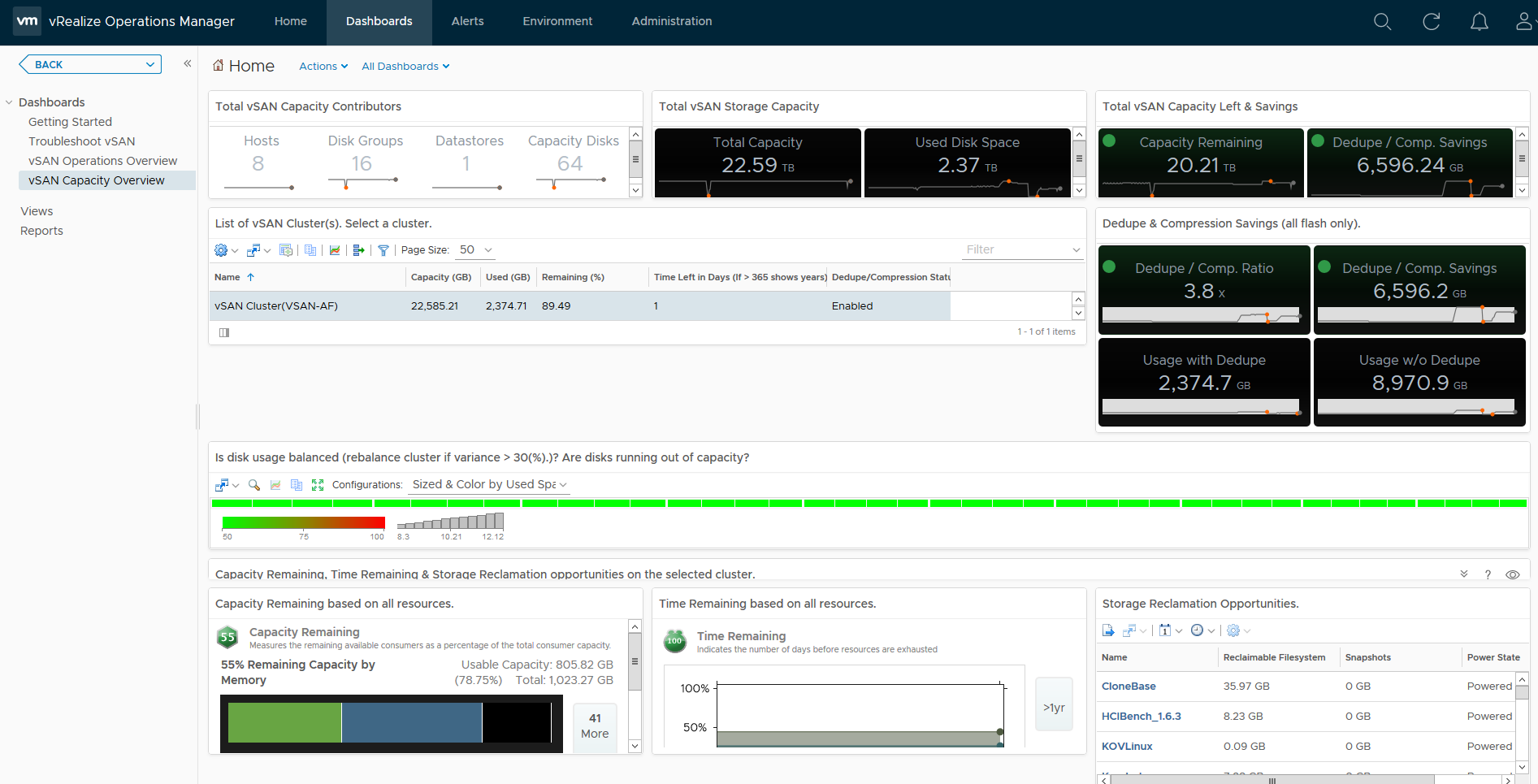
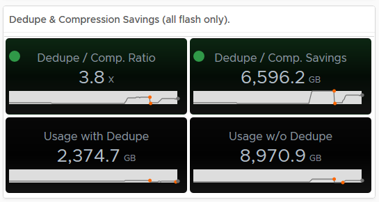 Hovering over an area of the graph will provide you an extract of the value at that point in time:
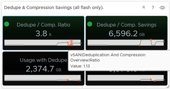 As you can see from the above, my dedupe/Compression dropped to 1.13, now if you tie this into the Used Disk Space screen, you can see that the usage dropped at the same time, indicating a lot of data was deleted (and it actually was on purpose):
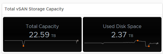 In my opinion having this data is pretty important, especially if the cluster is ingesting data and you want to see historically if this is affecting your dedupe/compression ratio for example.